I recently learned of the U.S. Large-Scale Solar Photovoltaic Database(Fujita et al. 2023) via the Data Is Plural newsletter, and was excited to explore the data. The database includes information about U.S. ground-mounted photovoltaic (PV) facilities with capacity of 1 megawatt or more. Note that there is an online data viewer available as well; here I will explore the data using R and Quarto.
Data
The data are available via an API, but for this analysis I chose to just download the entire data set as a csv file.
The database version I am using here is Version: USPVDB_V1_0_20231108.
A data codebook is also available and gives a detailed description of all the data fields.
I’ll first read the data into R and take a look at the complete table (Table 1).
Table 1: Table of full USPVDB dataset from csv file.
Interactive map of sites
Before analyzing the data, I wanted to make an interactive map (Figure 1) of all the sites, using the leaflet(Cheng et al. 2023a) package.
Make leaflet map of PV sites
leaflet(data =pv)%>%addTiles()%>%addMarkers(lng =~xlong, lat =~ylat, label =~p_name, popup =paste(pv$p_name, "<br>","Opened", pv$p_year, "<br>","DC Cap =", pv$p_cap_dc, "MW", "<br>","AC Cap =", pv$p_cap_ac, "MW"), clusterOptions =markerClusterOptions())
Figure 1: Interactive map of PV sites in USPVDB database
Analysis
I chose to break my analysis into two sections: Total (all states added together) and Per-State (data aggregated by individual states).
Total
For the total analysis, I will group the data by year and summarize some of the fields (Table 2), including the number of sites opened and the total capacity of all sites.
Summarize data by year
pv_yearly<-pv|>filter(p_year>=2002)|># only 1 site opened before 2002 (in 1986)group_by(p_year)|>summarize(tot_cap_dc =sum(p_cap_dc, na.rm =TRUE), tot_cap_ac =sum(p_cap_ac, na.rm =TRUE), n_sites =n(),)|>mutate(cum_cap_dc =cumsum(tot_cap_dc), cum_cap_ac =cumsum(tot_cap_ac), cum_n_sites =cumsum(n_sites))pv_yearly|>DT::datatable(rownames =FALSE, options =list(pageLength =5))
Table 2: Data aggregated/summarized by year
Number of sites opened and capacity added per year
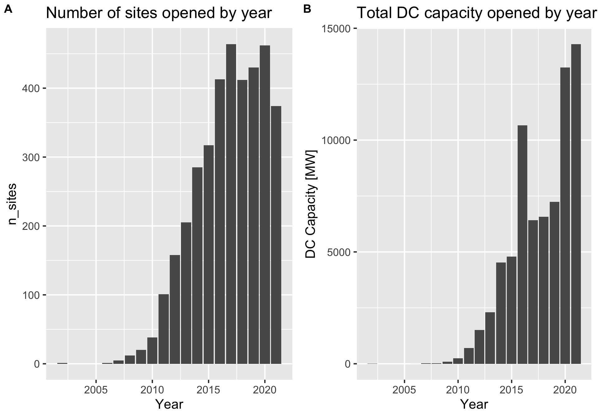
The number of PV sites opened per year (Figure 2) began to increase rapidly around 2007 and has remained high (more than 400) since 2015. The total capacity added is more variable, reflecting the fact that some sites are much larger than others.
Code
p1<-pv_yearly|>ggplot(aes(p_year, n_sites))+geom_col()+labs(title ="Number of sites opened by year", x ="Year")p2<-pv_yearly|>ggplot(aes(p_year, tot_cap_dc))+geom_col()+labs(title ="Total DC capacity opened by year", x ="Year", y ="DC Capacity [MW]")cowplot::plot_grid(p1, p2, labels ="AUTO")
Figure 2: (A) Number of sites opened per year (B) Total capacity (DC) opened per year
Cumulative sums
Next we can look at the cumulative sum of the number of PV sites and total capacity (Figure 3). Both began to increase around 2007, and really took off starting around 2012.
Code
p1<-pv_yearly|>filter(p_year>2006)|>ggplot(aes(p_year, cum_n_sites))+geom_area(fill ='gray')+geom_line(linewidth =2)+labs(title ="Number of PV Sites", x ='Year', y ="# Sites")p2<-pv_yearly|>filter(p_year>2006)|>ggplot(aes(p_year, cum_cap_dc))+geom_area(fill ='gray')+geom_line(linewidth =2)+labs(title ="PV Capacity", x ='Year', y ="DC Capacity [MW]")cowplot::plot_grid(p1, p2, labels ="AUTO")
Figure 3: (A) Cumulative sum of total number of sites over time (B) Cumulative sum of total capacity (DC) over time
Per-State Analysis
In this section I will analyze the data per state, so I will group by state and compute totals (Table 3). I’ve chosen not to also group by year in this sections, so the summary values are the total for all years included in the data (basically the current status).
Table 3: Table of data grouped and summarized by state
Number of sites and total capacity per state
Figure 4 shows the top ten states by number of PV sites and total capacity.
It is interesting to note that the states with the most sites do not always have the most capacity, reflecting that some states tend to have fewer but larger PV sites. For example, MA has 4th most sites, but is 12th in terms of total capacity.
Figure 4: (A) Number of PV sites per state (top 10 shown) (B) Total Capacity (DC) of PV sites per state (top 10 shown)
Choropleths
Next I will make some choropleth maps to help visualize the state data. In these figures, the color of each state corresponds to a variable. For now I will restrict the maps to the lower 48 US states to make the plotting easier.
The maps are made using the leaflet(Cheng et al. 2023b) package and are interactive; you can drag the map and zoom in/out, and clicking on a state will display some information about it.
I will get the state shapefiles for plotting from the tigris(Walker 2023) package.
Number of sites per state
Code
map_val<-"n_pv"dat_to_map<-df_comb|>rename(val_to_map =all_of(map_val))# make color palettecol_pal<-leaflet::colorNumeric(palette ="viridis", domain =dat_to_map$val_to_map)leaflet()%>%# addTiles() %>% # adds OpenStretMap basemapaddPolygons(data =dat_to_map, weight =1, color ="black", popup =paste(dat_to_map$STUSPS, "<br>"," # Sites: ", dat_to_map$val_to_map, "<br>"), fillColor =~col_pal(val_to_map), fillOpacity =0.6)%>%addLegend(data =dat_to_map, pal =col_pal, values =~val_to_map, opacity =1, title ="# PV Sites <br> Per State")
Figure 5: Choropleth of the number of PV sites per state (lower 48 only)
Total Capacity per state
Code
map_val<-"tot_cap_dc"dat_to_map<-df_comb|>rename(val_to_map =all_of(map_val))# make color palettecol_pal<-leaflet::colorNumeric(palette ="viridis", domain =dat_to_map$val_to_map)leaflet()%>%# addTiles() %>% # adds OpenStretMap basemapaddPolygons(data =dat_to_map, weight =1, color ="black", popup =paste(dat_to_map$STUSPS, "<br>"," PV Cap DC: ", dat_to_map$val_to_map,"MW", "<br>"), fillColor =~col_pal(val_to_map), fillOpacity =0.6)%>%addLegend(data =dat_to_map, pal =col_pal, values =~val_to_map, opacity =1, title ="DC Capacity [MW] <br> Per State")
Figure 6: Choropleth of total PV capacity (DC) per state (lower 48 only)
Average capacity per state
Some states tend to have fewer but larger sites, and vice-versa. Figure 7 shows the average site capacity for each state.
Code
map_val<-"avg_site_cap_dc"dat_to_map<-df_comb|>rename(val_to_map =all_of(map_val))# make color palettecol_pal<-leaflet::colorNumeric(palette ="viridis", domain =dat_to_map$val_to_map)leaflet()%>%# addTiles() %>% # adds OpenStretMap basemapaddPolygons(data =dat_to_map, weight =1, color ="black", popup =paste(dat_to_map$STUSPS, "<br>"," Avg Cap: ", dat_to_map$val_to_map,"MW" ,"<br>"), fillColor =~col_pal(val_to_map), fillOpacity =0.6)%>%addLegend(data =dat_to_map, pal =col_pal, values =~val_to_map, opacity =1, title ="Average Site Cap [MW] <br> Per State")
Figure 7: Choropleth of average site capacity (MW DC) per state (lower 48 only)
Future Analysis/Questions
The USPVDB only includes ground-based PV sites with a capacity greater than 1MW. It would be interesting to also examine other PV sources such as residential or commerical rooftop arrays.
I assume that the PV site capacities listed in database are the maximum capacity under ideal conditions (ie full sun, clear skies); it would be interesting to know what the actual annual outputs are considering latitude, weather, etc..
SessionInfo
To enhance reproducibility, I have included my SessionInfo output below. There is also a renv file available in the github repo for my site.
Cheng, Joe, Barret Schloerke, Bhaskar Karambelkar, and Yihui Xie. 2023a. “Leaflet: Create Interactive Web Maps with the JavaScript ’Leaflet’ Library.”https://CRAN.R-project.org/package=leaflet.
Fujita, K. Sydny, Zachary H. Ancona, Louisa A. Kramer, Mary Straka, Tandie E. Gautreau, Dana Robson, Chris Garrity, Ben Hoen, and Jay E. Diffendorfer. 2023. “Georectified Polygon Database of Ground-Mounted Large-Scale Solar Photovoltaic Sites in the United States.”Scientific Data 10 (1): 760. https://doi.org/10.1038/s41597-023-02644-8.
---title: "Analysis of the U.S. Large-Scale Solar Photovoltaic Database (USPVDB) in R"author: "Andy Pickering"date: "2023-12-21"date-modified: todayformat: html: code-fold: true code-tools: true toc: true fig-cap-location: bottom tbl-cap-location: bottom fig-width: 10 fig-height: 7freeze: autocategories: [visualization, mapping, energy, R]bibliography: references.bib---# IntroductionI recently learned of the [U.S. Large-Scale Solar Photovoltaic Database](https://eerscmap.usgs.gov/uspvdb/){.uri} [@fujita2023] via the [Data Is Plural](https://www.data-is-plural.com/) newsletter, and was excited to explore the data. The database includes information about U.S. ground-mounted photovoltaic (PV) facilities with capacity of 1 megawatt or more. Note that there is an [online data viewer](https://eerscmap.usgs.gov/uspvdb/viewer/#3/37.25/-96.25){.uri} available as well; here I will explore the data using R and Quarto.# DataThe data are available via an [API](https://eerscmap.usgs.gov/uspvdb/api-doc/), but for this analysis I chose to just download the entire [data set as a csv file](https://eerscmap.usgs.gov/uspvdb/data/).- The database version I am using here is *Version: USPVDB_V1_0_20231108*.- A [data codebook](https://emp.lbl.gov/publications/us-large-scale-solar-photovoltaic) is also available and gives a detailed description of all the data fields.I'll first read the data into R and take a look at the complete table (@tbl-all-data).```{r}#| label: libraries-read-data#| code-summary: Load Libraries and read datasuppressPackageStartupMessages(library(tidyverse))ggplot2::theme_set(theme_grey(base_size =16))library(DT) # nbice data tablessuppressPackageStartupMessages(library(tigris)) # get state shapefiles for mappingoptions(tigris_use_cache =TRUE)library(leaflet) # interactive mapssuppressPackageStartupMessages(library(cowplot)) # make multi-panel plotspv <-read_csv('data/uspvdb_v1_0_20231108.csv', show_col_types =FALSE)``````{r}#| label: tbl-all-data#| tbl-cap: Table of full USPVDB dataset from csv file.#| code-summary: Make Data tablepv |> DT::datatable(rownames =FALSE, options =list(pageLength =5))```# Interactive map of sitesBefore analyzing the data, I wanted to make an interactive map (@fig-map-sites) of all the sites, using the *leaflet* [@leaflet] package.```{r}#| label: fig-map-sites#| fig-cap: Interactive map of PV sites in USPVDB database#| code-summary: Make leaflet map of PV sitesleaflet(data = pv) %>%addTiles() %>%addMarkers(lng =~xlong, lat =~ylat, label =~p_name,popup =paste(pv$p_name, "<br>","Opened", pv$p_year, "<br>","DC Cap =", pv$p_cap_dc, "MW", "<br>","AC Cap =", pv$p_cap_ac, "MW"),clusterOptions =markerClusterOptions() )```# AnalysisI chose to break my analysis into two sections: *Total* (all states added together) and *Per-State* (data aggregated by individual states).## TotalFor the total analysis, I will group the data by year and summarize some of the fields (@tbl-yearly), including the number of sites opened and the total capacity of all sites.```{r}#| label: tbl-yearly#| tbl-cap: Data aggregated/summarized by year#| code-summary: Summarize data by yearpv_yearly <- pv |>filter(p_year >=2002) |># only 1 site opened before 2002 (in 1986)group_by(p_year) |>summarize(tot_cap_dc =sum(p_cap_dc, na.rm =TRUE),tot_cap_ac =sum(p_cap_ac, na.rm =TRUE),n_sites =n(), ) |>mutate(cum_cap_dc =cumsum(tot_cap_dc),cum_cap_ac =cumsum(tot_cap_ac),cum_n_sites =cumsum(n_sites) )pv_yearly |> DT::datatable(rownames =FALSE, options =list(pageLength =5))```### Number of sites opened and capacity added per yearThe number of PV sites opened per year (@fig-yearly-nsites-cap-dc) began to increase rapidly around 2007 and has remained high (more than 400) since 2015. The total capacity added is more variable, reflecting the fact that some sites are much larger than others.```{r}#| label: fig-yearly-nsites-cap-dc#| fig-cap: (A) Number of sites opened per year (B) Total capacity (DC) opened per yearp1 <- pv_yearly |>ggplot(aes(p_year, n_sites)) +geom_col() +labs(title ="Number of sites opened by year",x ="Year")p2 <- pv_yearly |>ggplot(aes(p_year, tot_cap_dc)) +geom_col() +labs(title ="Total DC capacity opened by year",x ="Year",y ="DC Capacity [MW]")cowplot::plot_grid(p1, p2, labels ="AUTO")```### Cumulative sumsNext we can look at the cumulative sum of the number of PV sites and total capacity (@fig-yearly-cumsum-nsites-cap-dc). Both began to increase around 2007, and really took off starting around 2012.```{r}#| label: fig-yearly-cumsum-nsites-cap-dc#| fig-cap: (A) Cumulative sum of total number of sites over time (B) Cumulative sum of total capacity (DC) over timep1 <- pv_yearly |>filter(p_year >2006) |>ggplot(aes(p_year, cum_n_sites)) +geom_area(fill ='gray') +geom_line(linewidth =2) +labs(title ="Number of PV Sites",x ='Year',y ="# Sites")p2 <- pv_yearly |>filter(p_year >2006) |>ggplot(aes(p_year, cum_cap_dc)) +geom_area(fill ='gray') +geom_line(linewidth =2) +labs(title ="PV Capacity",x ='Year',y ="DC Capacity [MW]")cowplot::plot_grid(p1, p2, labels ="AUTO")```## Per-State AnalysisIn this section I will analyze the data per state, so I will group by state and compute totals (@tbl-pv-group-by-state). I've chosen not to also group by year in this sections, so the summary values are the total for all years included in the data (basically the current status).```{r}#| label: tbl-pv-group-by-state#| tbl-cap: Table of data grouped and summarized by state#| code-summary: Summarize data by State# summarize pv data by statepv_states <- pv |>group_by(p_state) |>summarise(n_pv =n(),tot_cap_dc =sum(p_cap_dc, na.rm =TRUE),tot_cap_ac =sum(p_cap_ac, na.rm =TRUE),avg_site_cap_dc =round(mean(p_cap_dc, na.rm =TRUE),2) )pv_states |> DT::datatable(rownames =FALSE, options =list(pageLength =5))```### Number of sites and total capacity per state@fig-n-sites-cap-per-state shows the top ten states by number of PV sites and total capacity.- It is interesting to note that the states with the most sites do not always have the most capacity, reflecting that some states tend to have fewer but larger PV sites. For example, MA has 4th most sites, but is 12th in terms of total capacity.```{r}#| label: fig-n-sites-cap-per-state#| fig-cap: (A) Number of PV sites per state (top 10 shown) (B) Total Capacity (DC) of PV sites per state (top 10 shown)p1 <- pv_states |>mutate(p_state =fct_reorder(p_state, n_pv)) |>slice_max(order_by = n_pv, n =10) |>ggplot(aes(p_state, n_pv)) +geom_col() +coord_flip() +labs(y ="Number of sites",x ="State")p2 <- pv_states |>mutate(p_state =fct_reorder(p_state, tot_cap_dc)) |>slice_max(order_by = tot_cap_dc, n =10) |>ggplot(aes(p_state, tot_cap_dc)) +geom_col() +coord_flip() +labs(y ="Total capacity of PV sites [MW]",x ="State")cowplot::plot_grid(p1, p2, labels ="AUTO")```## ChoroplethsNext I will make some choropleth maps to help visualize the state data. In these figures, the color of each state corresponds to a variable. For now I will restrict the maps to the lower 48 US states to make the plotting easier.- The maps are made using the *leaflet* [@leaflet-2] package and are interactive; you can drag the map and zoom in/out, and clicking on a state will display some information about it.- I will get the state shapefiles for plotting from the *tigris* [@tigris] package.```{r}#| label: get-states-data#| code-summary: Get shapefiles for states#| echo: false# get states shapefilesstates <-suppressMessages(tigris::states(cb =TRUE, progress_bar =FALSE)) |>filter(!STUSPS %in%c('AK','HI','GU','PR','VI','AS','MP')) |># continental 48 only sf::st_transform(crs =4326)# combine shapefiles data with data to plotdf_comb <- states |>left_join(pv_states, by =c('STUSPS'='p_state')) ```### Number of sites per state```{r}#| label: fig-choropleth-n-states#| fig-cap: Choropleth of the number of PV sites per state (lower 48 only)map_val <-"n_pv"dat_to_map <- df_comb |>rename(val_to_map =all_of(map_val))# make color palettecol_pal <- leaflet::colorNumeric(palette ="viridis",domain = dat_to_map$val_to_map)leaflet() %>%# addTiles() %>% # adds OpenStretMap basemapaddPolygons(data = dat_to_map,weight =1,color ="black",popup =paste(dat_to_map$STUSPS, "<br>"," # Sites: ", dat_to_map$val_to_map, "<br>"),fillColor =~col_pal(val_to_map),fillOpacity =0.6) %>%addLegend(data = dat_to_map,pal = col_pal,values =~val_to_map,opacity =1,title ="# PV Sites <br> Per State" )```### Total Capacity per state```{r}#| label: fig-choropleth-capacity-states#| fig-cap: Choropleth of total PV capacity (DC) per state (lower 48 only)map_val <-"tot_cap_dc"dat_to_map <- df_comb |>rename(val_to_map =all_of(map_val))# make color palettecol_pal <- leaflet::colorNumeric(palette ="viridis",domain = dat_to_map$val_to_map)leaflet() %>%# addTiles() %>% # adds OpenStretMap basemapaddPolygons(data = dat_to_map,weight =1,color ="black",popup =paste(dat_to_map$STUSPS, "<br>"," PV Cap DC: ", dat_to_map$val_to_map,"MW", "<br>"),fillColor =~col_pal(val_to_map),fillOpacity =0.6) %>%addLegend(data = dat_to_map,pal = col_pal,values =~val_to_map,opacity =1,title ="DC Capacity [MW] <br> Per State" )```### Average capacity per stateSome states tend to have fewer but larger sites, and vice-versa. @fig-choropleth-avg-capacity-states shows the average site capacity for each state.```{r}#| label: fig-choropleth-avg-capacity-states#| fig-cap: Choropleth of average site capacity (MW DC) per state (lower 48 only)map_val <-"avg_site_cap_dc"dat_to_map <- df_comb |>rename(val_to_map =all_of(map_val))# make color palettecol_pal <- leaflet::colorNumeric(palette ="viridis",domain = dat_to_map$val_to_map)leaflet() %>%# addTiles() %>% # adds OpenStretMap basemapaddPolygons(data = dat_to_map,weight =1,color ="black",popup =paste(dat_to_map$STUSPS, "<br>"," Avg Cap: ", dat_to_map$val_to_map,"MW" ,"<br>"),fillColor =~col_pal(val_to_map),fillOpacity =0.6) %>%addLegend(data = dat_to_map,pal = col_pal,values =~val_to_map,opacity =1,title ="Average Site Cap [MW] <br> Per State" )```# Future Analysis/Questions- The USPVDB only includes ground-based PV sites with a capacity greater than 1MW. It would be interesting to also examine other PV sources such as residential or commerical rooftop arrays.- I assume that the PV site capacities listed in database are the maximum capacity under ideal conditions (ie full sun, clear skies); it would be interesting to know what the actual annual outputs are considering latitude, weather, etc..# SessionInfoTo enhance reproducibility, I have included my *SessionInfo* output below. There is also a *renv* file available in the github repo for my site.```{r}sessionInfo()```# References