Time of Use (TOU) electricity pricing can shift customer usage patterns and help manage supply-demand imbalances
But it may also introduce artificial spikes in demand that could strain the local grid.
The financial savings (~$2/month for my home) may not be sufficient to motivate most people to make changes requiring much effort.
Introduction
In this blog post, I’ll analyze our home electricity usage, using hourly data from our “smart meter”. Our electricity provider (Xcel) currently bills us according to Time-Of-Use (TOU) pricing, where electricity costs more in the weekday afternoon-early evening period when demand tends to be higher and solar energy generation is falling.
I was interested in quantifying how much the TOU pricing has affected our electricity usage patterns. Qualitatively I know we have tried to modify our behavior to take advantage of the TOU rate structure in a couple ways:
We try to avoid using large appliances (dishwasher, oven, washer and dryer, etc.) during peak periods.
We currently have two electric vehicles; one full EV and one plug-in hybrid. We typically charge these at home on a level 1 (120V) charger. They both have charge timers that we have programmed to turn off during peak periods (3-7 pm weekdays).
In addition to seeing how the TOU pricing has affected our electricity usage patterns, I am curious about how it might be introducing an artificial spike in electricity demand if everyone turns on their appliances or starts charging their EVs right at 7pm when the peak pricing ends. This issue was discussed in a recent blog post from EnergyHub.
Data
Downloading data
Unfortunately Xcel does not have a public API or a way to request a date-range of data, so I had to download a hourly data file for each day individually. I downloaded hourly data for a ~ 1 month period and combined the files into a single data frame in a separate script.
Our current Xcel TOU rate categories during the winter are :
Weekdays 1-3pm: mid-peak ($0.15/kWh)
Weekdays 3-7pm: peak ($0.19/kWh)
All other times (and holidays): off-peak ($0.12/kWh)
Table 1 shows an example of the data I working with. I’ve added columns for the hour, day of week, and an indicator for whether it is a weekday or weekend. Ideally I would have data from before TOU pricing was implemented to compare to, but this is not possible because TOU pricing began soon after we got our smart meter. I will instead compare weekdays and weekends, since there is no peak pricing on weekends.
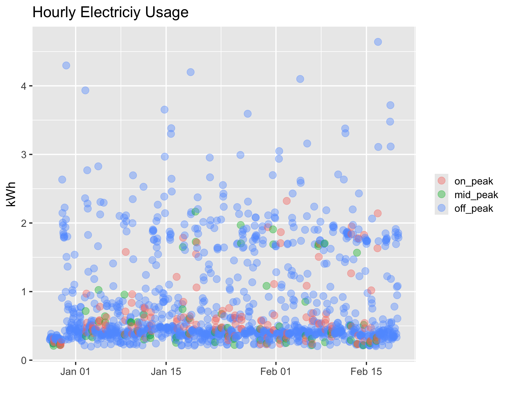
Figure 1 shows all hourly values, colored by the rate category. This figure shows that nearly all the larger values (greater than ~2 kWh) are during off-peak times. Histograms of the data for each rate category (Figure 2) also demonstrates this pattern; note the much longer tail for the off-peak period. Table 2 shows a similar pattern quanitified by the mean, median, and max of each rate category.
Code
df|>ggplot(aes(datetime, kwh))+geom_point(size =4, alpha =0.4, aes(color =rate_category))+labs( x ='', y ='kWh', title ="Hourly Electriciy Usage")+theme(legend.title =element_blank())
Figure 1: Hourly electricity usage [kWh] vs time, colored by rate category
Table 2: Comparison of electricity use statistics for each rate category
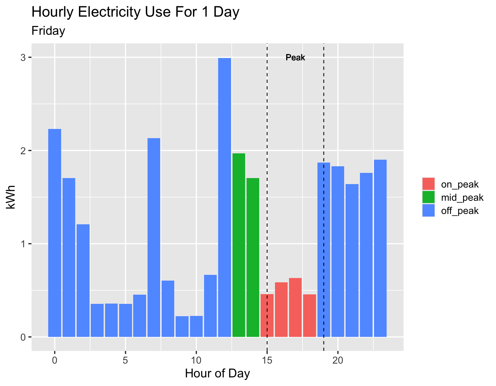
Example electricity usage for a single day
Figure 3 shows an example of hourly electricity usage for a single weekday. Note the sharp increase at 7pm, largely due to EV charging turning on. There is also a sharp decrease at 3pm (the beginning of peak pricing), where EV was charging and shut off on timer.
Code
the_date<-'2024-01-26'df|>filter(date==the_date)|>ggplot(aes(hour, kwh))+geom_col(aes(fill =rate_category))+labs(x ="Hour of Day", y ="kWh", title ="Hourly Electricity Use For 1 Day", subtitle =lubridate::wday(the_date, label =TRUE, abbr =FALSE))+theme(legend.title =element_blank())+geom_vline(xintercept =c(15,19),linetype ='dashed', color ='black')+geom_text(aes(17, 3, label ="Peak"))
Warning in geom_text(aes(17, 3, label = "Peak")): All aesthetics have length 1, but the data has 24 rows.
ℹ Please consider using `annotate()` or provide this layer with data containing
  a single row.
Figure 3: Hourly electricity usage for a single weekday. Dashed vertical lines indicate peak pricing times (3-7pm weekdays).
How does this pattern look for all the days?
We have seen an example of one day where there is a clear influence of the TOU pricing, but how common is this pattern? Figure 4 shows the average hourly electricity usage for the entire data set. Averages are computed separately for weekdays and weekends as a way of comparing with/without TOU pricing (weekends do not have peak pricing). Dashed vertical lines indicate peak pricing hours (3-7 pm weekdays only).
Code
g<-df|>mutate(wday_label =if_else(is_weekend==0, 'Weekdays','Weekends'))|>group_by(hour, wday_label)|>summarize(usage =mean(kwh), .groups ='drop')|>ggplot(aes(hour, usage, group =wday_label))+geom_line(aes(color =wday_label), linewidth =1.5)+geom_vline(xintercept =c(13,15,19),linetype ='dashed', color ='black')+theme(legend.title =element_blank())+labs(y ='kWh', x ='Hour', title ='Average Hourly electric usage', subtitle ="Weekday/Weekend")+geom_text(aes(17, 1.8, label ="Peak"))+geom_text(aes(14, 1.7, label ="Mid-Peak"))g
Figure 4: Average hourly electricity usage for weekdays and weekends.Red lines indicate peak hours (weekdays)
Summary
Under TOU pricing, we have shifted our electricity usage and tend to use less during peak pricing.
On many days, this shift has created a new spike in demand at the end of peak pricing (7pm weekdays), as well as a sharp decrease in demand at the beginning of the peak pricing period.
This spike in demand could have negative consequences for the local energy infrastructure, as discussed in a recent blog post from EnergyHub .
Questions/observations /discussion
You might be wondering what the actual $ savings of using TOU pricing are and if the financial incentives are worth it? Excel gives an option to opt-out of TOU pricing, in which case the flat rate is currently $0.13/kWh. I did a quick calculation comparing our total cost with TOU vs using the same amount of electricity at the flat rate, and the savings were about $2 for a month. Not negligible, but probably not enough to motivate someone to put a ton of effort into changing their patterns.
Personally, I am more motivated by the environmental impacts. Reducing usage during peak demand periods could avoid having to fire up peaker plants that often run on fossil fuels, although it is difficult to know if that is actually happening. Ideally I would be able to see a real-time feed of the electricity generation fuel mix (for example Platte River Power Authority in northern Colorado), and shift my usage to times when there is more clean/renewable generation. As far as I know, Xcel does not currently provide this information publicly.
I would expect that this artificial spike issue will get worse as more households get EVs and install home chargers. Note that we are using Level 1 charging, this effect would be larger for those with home Level 2 chargers that charge at a faster rate.
SessionInfo
To enhance reproducibility, the R sessionInfo is included below.
---title: "How has time-of-use pricing affected our home electricity use?"date: 2024-02-28date-modified: todayimage: image.pngformat: html: code-link: true code-fold: true code-tools: true toc: true fig-width: 9 fig-height: 7 tbl-cap-location: bottomeditor: visualcategories: [EV, R, visualization, energy]draft: falsefreeze: auto---# TL;DR- Time of Use (TOU) electricity pricing can shift customer usage patterns and help manage supply-demand imbalances- *But* it may also introduce artificial spikes in demand that could strain the local grid.- The financial savings (\~\$2/month for my home) may not be sufficient to motivate most people to make changes requiring much effort.# IntroductionIn this blog post, I'll analyze our home electricity usage, using hourly data from our "[smart meter](https://coloradosun.com/2021/07/01/xcel-energy-smart-meters-time-of-use-billing/)". Our electricity provider ([Xcel](https://www.xcelenergy.com/)) currently bills us according to [Time-Of-Use (TOU) pricing](https://co.my.xcelenergy.com/s/billing-payment/residential-rates/time-of-use-pricing), where electricity costs more in the weekday afternoon-early evening period when demand tends to be higher and solar energy generation is falling.I was interested in quantifying how much the TOU pricing has affected our electricity usage patterns. Qualitatively I know we have tried to modify our behavior to take advantage of the TOU rate structure in a couple ways:- We try to avoid using large appliances (dishwasher, oven, washer and dryer, etc.) during peak periods.- We currently have two electric vehicles; one full EV and one plug-in hybrid. We typically charge these at home on a level 1 (120V) charger. They both have charge timers that we have programmed to turn off during peak periods (3-7 pm weekdays).In addition to seeing how the TOU pricing has affected our electricity usage patterns, I am curious about how it might be introducing an artificial spike in electricity demand if everyone turns on their appliances or starts charging their EVs right at 7pm when the peak pricing ends. This issue was discussed in a recent [blog post from EnergyHub](https://www.energyhub.com/blog/avoiding-gridlock-why-time-of-use-tou-rates-arent-the-long-term-solution-for-managing-local-ev-load){.uri}.# Data## Downloading dataUnfortunately Xcel does not have a public API or a way to request a date-range of data, so I had to download a hourly data file for each day individually. I downloaded hourly data for a \~ 1 month period and combined the files into a single data frame in a separate script.Our current Xcel TOU rate categories during the winter are :- Weekdays 1-3pm: *mid-peak* (\$0.15/kWh)- Weekdays 3-7pm: *peak* (\$0.19/kWh)- All other times (and holidays): *off-peak* (\$0.12/kWh)@tbl-hourly-elec shows an example of the data I working with. I've added columns for the hour, day of week, and an indicator for whether it is a weekday or weekend. Ideally I would have data from before TOU pricing was implemented to compare to, but this is not possible because TOU pricing began soon after we got our smart meter. I will instead compare weekdays and weekends, since there is no peak pricing on weekends.```{r}#| code-summary: Load libraries and read datasuppressPackageStartupMessages(library(tidyverse, quietly =TRUE))ggplot2::theme_set(theme_grey(base_size =16))suppressPackageStartupMessages(library(here))suppressPackageStartupMessages(library(DT))df <-readRDS('data/hourly_elec_xcel_combined') |>select(-c(category)) |>mutate(rate_category =as.factor(rate_category)) |>mutate(rate_category = forcats::fct_relevel(rate_category, c("on_peak","mid_peak","off_peak"))) ``````{r}#| label: tbl-hourly-elec#| tbl-cap: Hourly electricity usage datadf |>head() |> DT::datatable(options =list(pageLength =5), rownames =FALSE)```# Analysis@fig-kwh-all-ratecolor shows all hourly values, colored by the rate category. This figure shows that nearly all the larger values (greater than \~2 kWh) are during off-peak times. Histograms of the data for each rate category (@fig-histogram-rate-category) also demonstrates this pattern; note the much longer tail for the off-peak period. @tbl-rate-comparisons shows a similar pattern quanitified by the mean, median, and max of each rate category.```{r}#| label: fig-kwh-all-ratecolor#| fig-cap: Hourly electricity usage [kWh] vs time, colored by rate categorydf |>ggplot(aes(datetime, kwh)) +geom_point(size =4, alpha =0.4, aes(color = rate_category)) +labs( x ='',y ='kWh',title ="Hourly Electriciy Usage") +theme(legend.title =element_blank())``````{r}#| label: fig-histogram-rate-category#| fig-cap: Histograms of hourly electricity usage for each rate categorydf |>ggplot(aes(x = kwh)) +geom_histogram(binwidth =0.25) +geom_rug() +facet_grid(~rate_category) +labs(x ="kWh",y ='Count',title ="Histograms of hourly electric usage ")``````{r}#| label: tbl-rate-comparisons#| tbl-cap: Comparison of electricity use statistics for each rate categorydf |>group_by(rate_category) |>summarize(total_kwh =sum(kwh),average_kwh =round(mean(kwh),2),median_kwh =round(median(kwh),2),max_kwh =round(max(kwh),2) ) |>rename(`Rate Category`= rate_category) |> DT::datatable(options =list(pageLength =5), rownames =FALSE)```### Example electricity usage for a single day@fig-usage-oneday shows an example of hourly electricity usage for a single weekday. Note the sharp increase at 7pm, largely due to EV charging turning on. There is also a sharp decrease at 3pm (the beginning of peak pricing), where EV was charging and shut off on timer.```{r}#| label: fig-usage-oneday#| fig-cap: Hourly electricity usage for a single weekday. Dashed vertical lines indicate peak pricing times (3-7pm weekdays).the_date <-'2024-01-26'df |>filter(date == the_date) |>ggplot(aes(hour, kwh)) +geom_col(aes(fill = rate_category)) +labs(x ="Hour of Day",y ="kWh",title ="Hourly Electricity Use For 1 Day",subtitle = lubridate::wday(the_date, label =TRUE, abbr =FALSE)) +theme(legend.title =element_blank()) +geom_vline(xintercept =c(15,19),linetype ='dashed', color ='black') +geom_text(aes(17, 3, label ="Peak")) ```### How does this pattern look for all the days?We have seen an example of one day where there is a clear influence of the TOU pricing, but how common is this pattern? @fig-avg-usage_weekday-weekend shows the average hourly electricity usage for the entire data set. Averages are computed separately for weekdays and weekends as a way of comparing with/without TOU pricing (weekends do not have peak pricing). Dashed vertical lines indicate peak pricing hours (3-7 pm weekdays only).```{r}#| label: fig-avg-usage_weekday-weekend#| fig-cap: Average hourly electricity usage for weekdays and weekends.Red lines indicate peak hours (weekdays)g <- df |>mutate(wday_label =if_else(is_weekend ==0, 'Weekdays','Weekends')) |>group_by(hour, wday_label) |>summarize(usage =mean(kwh), .groups ='drop') |>ggplot(aes(hour, usage, group = wday_label)) +geom_line(aes(color = wday_label), linewidth =1.5) +geom_vline(xintercept =c(13,15,19),linetype ='dashed', color ='black') +theme(legend.title =element_blank()) +labs(y ='kWh',x ='Hour',title ='Average Hourly electric usage',subtitle ="Weekday/Weekend") +geom_text(aes(17, 1.8, label ="Peak")) +geom_text(aes(14, 1.7, label ="Mid-Peak"))g```## Summary- Under TOU pricing, we have shifted our electricity usage and tend to use less during peak pricing.- On many days, this shift has created a new spike in demand at the end of peak pricing (7pm weekdays), as well as a sharp decrease in demand at the beginning of the peak pricing period.- This spike in demand could have negative consequences for the local energy infrastructure, as discussed in a recent [blog post from EnergyHub](https://www.energyhub.com/blog/avoiding-gridlock-why-time-of-use-tou-rates-arent-the-long-term-solution-for-managing-local-ev-load){.uri} .### Questions/observations /discussion- You might be wondering what the actual \$ savings of using TOU pricing are and if the financial incentives are worth it? Excel gives an option to opt-out of TOU pricing, in which case the flat rate is currently \$0.13/kWh. I did a quick calculation comparing our total cost with TOU vs using the same amount of electricity at the flat rate, and the savings were about \$2 for a month. Not negligible, but probably not enough to motivate someone to put a ton of effort into changing their patterns.- Personally, I am more motivated by the environmental impacts. Reducing usage during peak demand periods could avoid having to fire up [peaker plants](https://en.wikipedia.org/wiki/Peaking_power_plant) that often run on fossil fuels, although it is difficult to know if that is actually happening. Ideally I would be able to see a real-time feed of the electricity generation fuel mix (for example [Platte River Power Authority in northern Colorado](https://www.prpa.org/energy-production/)), and shift my usage to times when there is more clean/renewable generation. As far as I know, Xcel does not currently provide this information publicly.- I would expect that this artificial spike issue will get worse as more households get EVs and install home chargers. Note that we are using Level 1 charging, this effect would be larger for those with home Level 2 chargers that charge at a faster rate.# SessionInfoTo enhance reproducibility, the R *sessionInfo* is included below.```{r}sessionInfo()```